MightyNest
Hello, clean + green journey
MightyNest is a monthly subscription box and online store. One month at a time, it introduces healthy green living to its members.
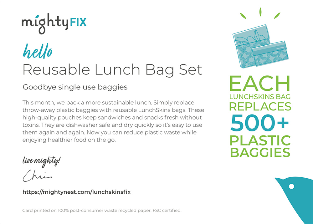
I initiated and led the redesign of the core product offering, the MightyFix membership journey, a CX flow that weaves together the real world (unboxing & product use) and digital (email & webpages, mobile & desktop).
This far-reaching project addressed nearly every member touchpoint: initial sign-up, 3D unboxing experience, email communications & sequence, website tie-ins and marketing/pr communications. I also directed and wrote nearly all of the content for 21+ months & 273 touchpoints in the customer journey
- Vision
- CX strategy
- CX design
- Product development
- Content strategy
- Writing
- Copywriting for multivariate A/B testing
If you’d like to see the full case study, content strategy and more examples. please reach out.
Creating a scalable customer journey ecosystem
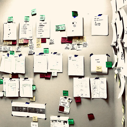
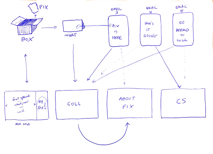
Early high level flows set up the basic relationship between experiences, communications and actions.
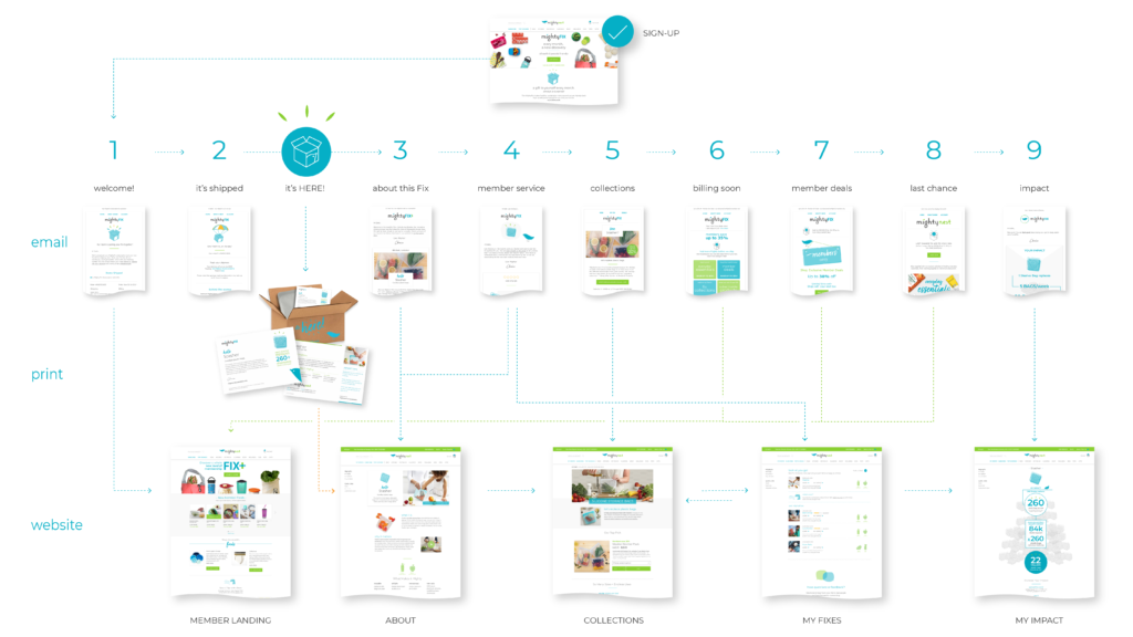
The final ecosystem included 13+ unique monthly touchpoints. The prototype became the template for ongoing design and content.
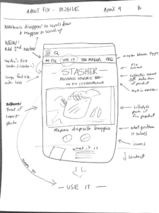
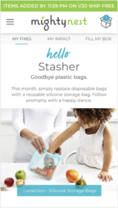
Web pages
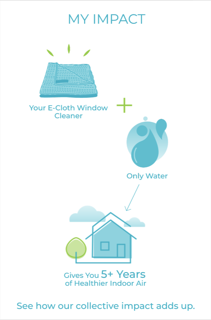
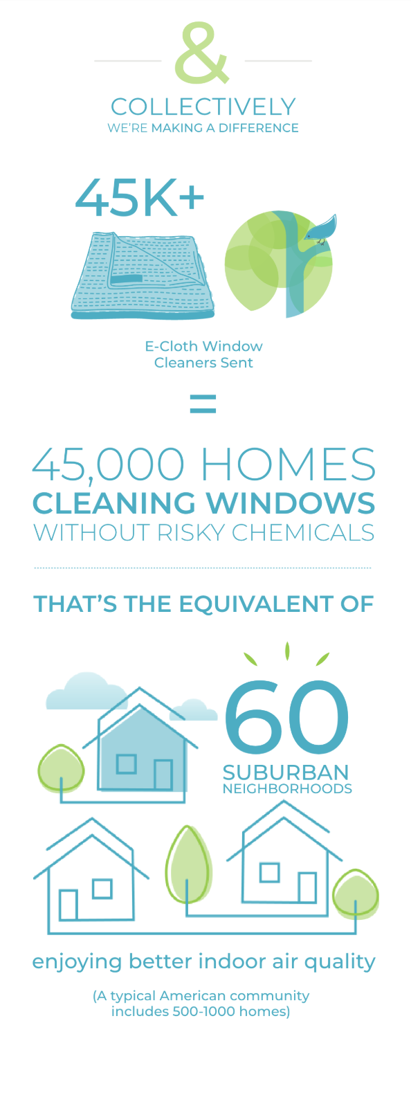
New infographic content helps members visualize their impact.

